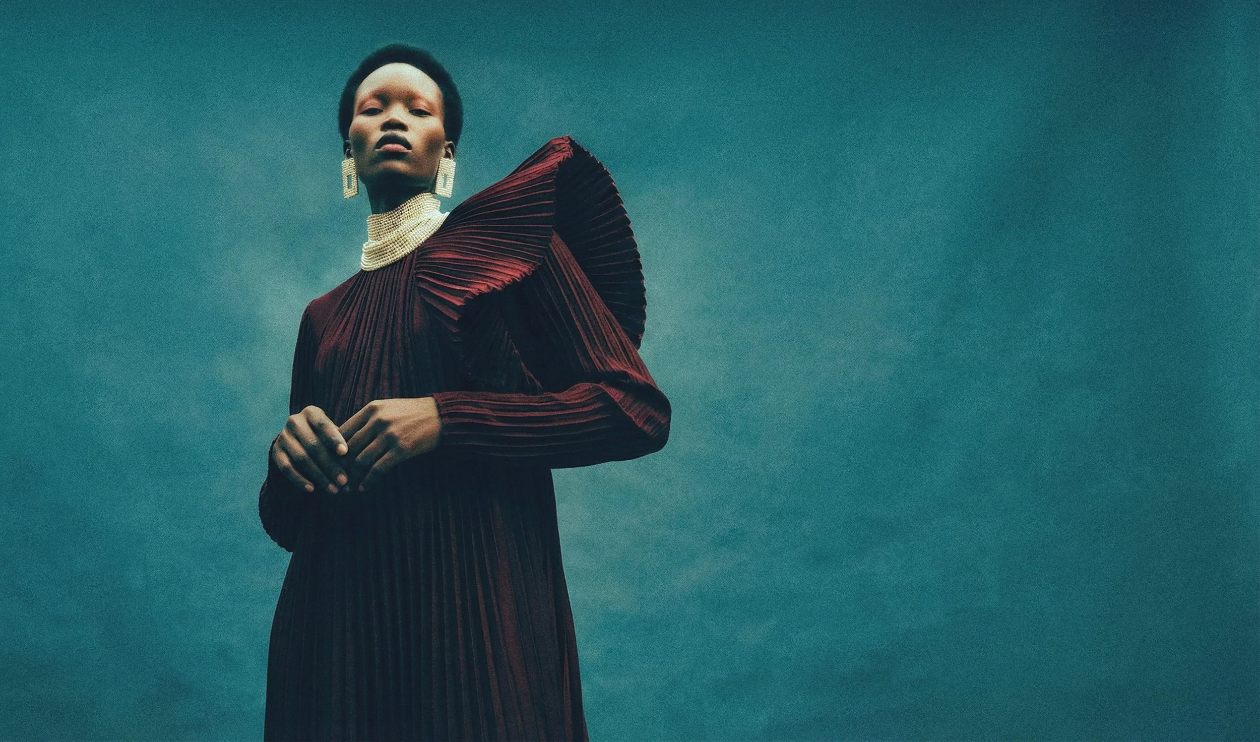
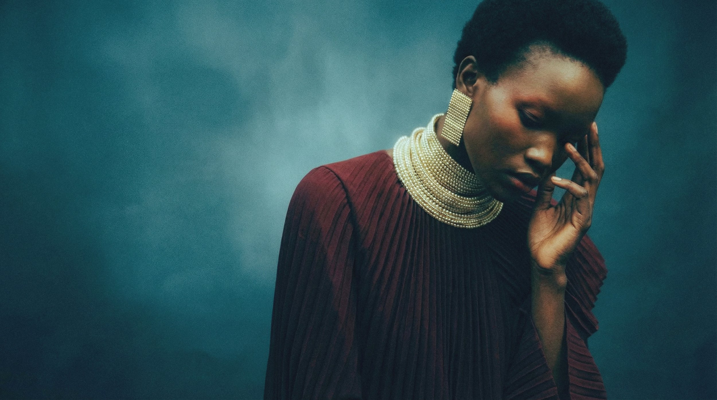
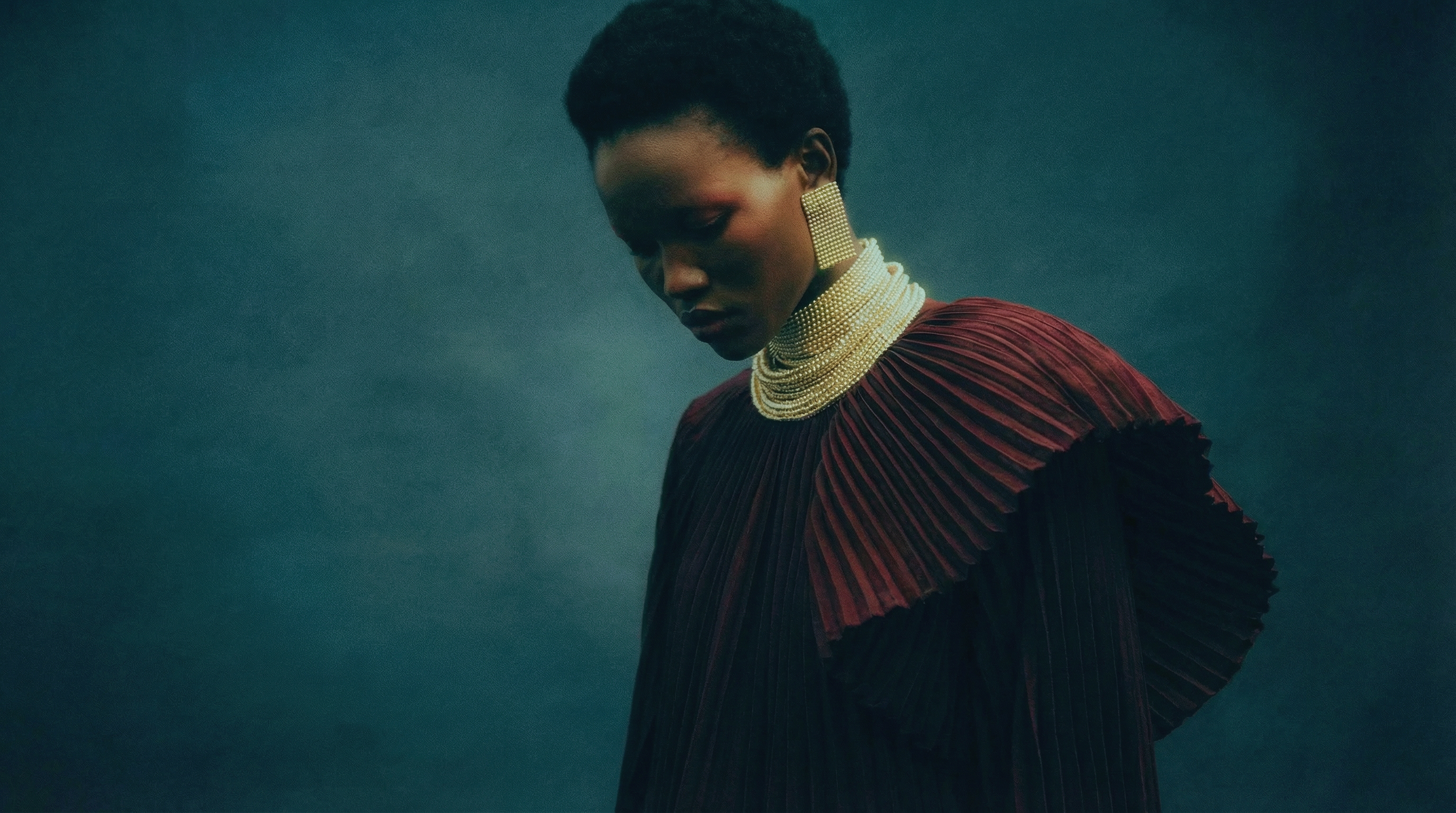
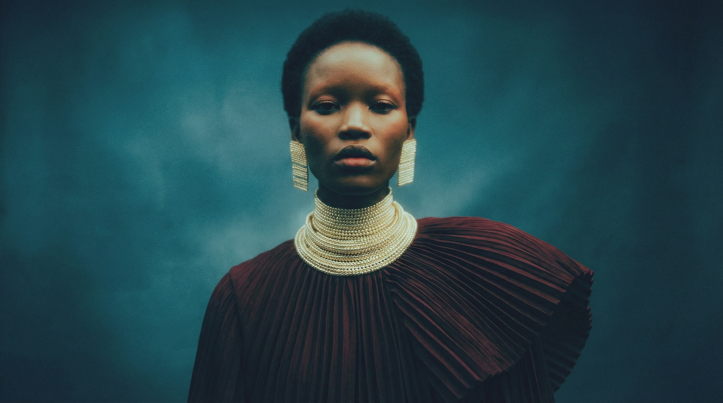
HUES
A study in restraint and color tension.
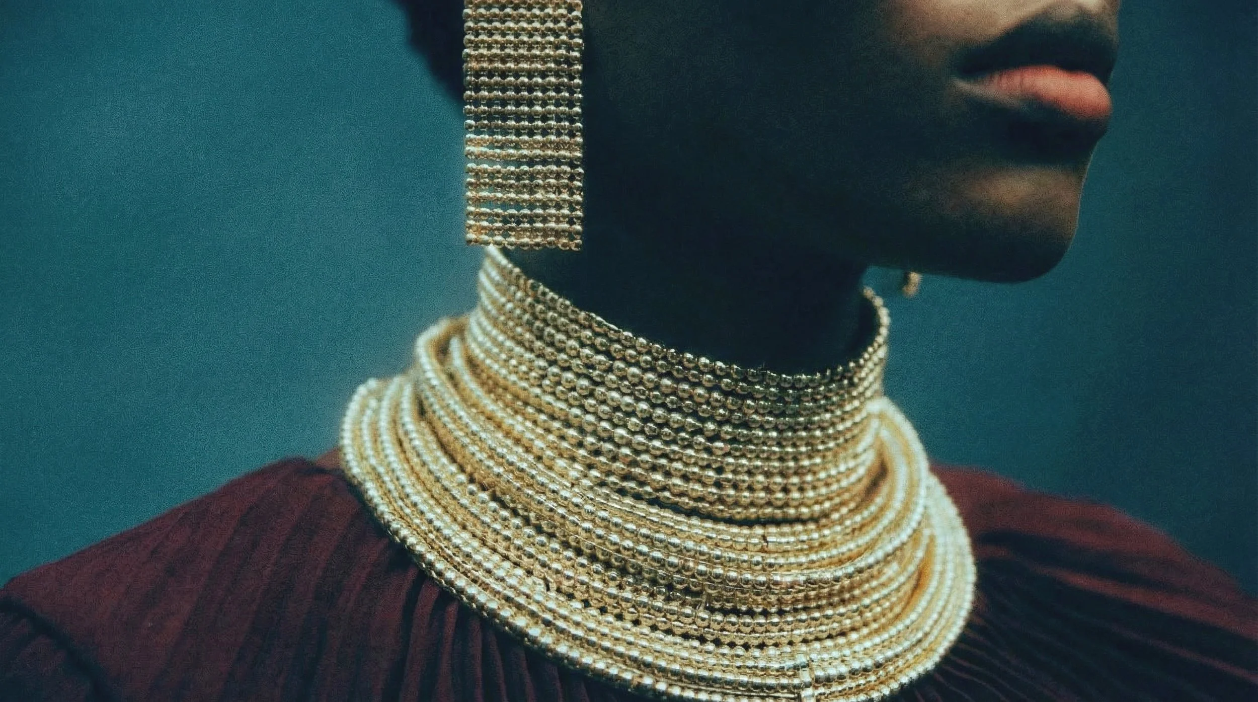
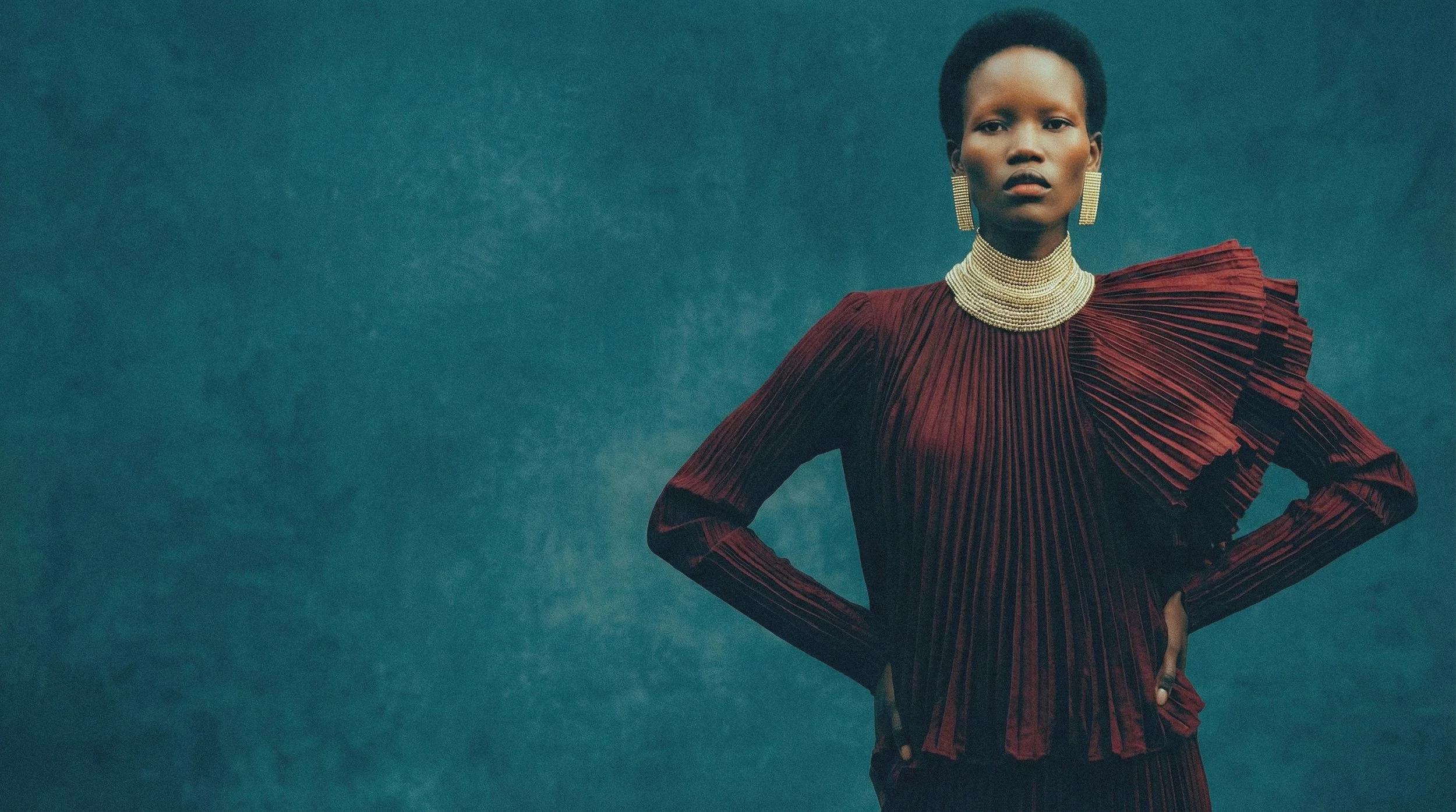
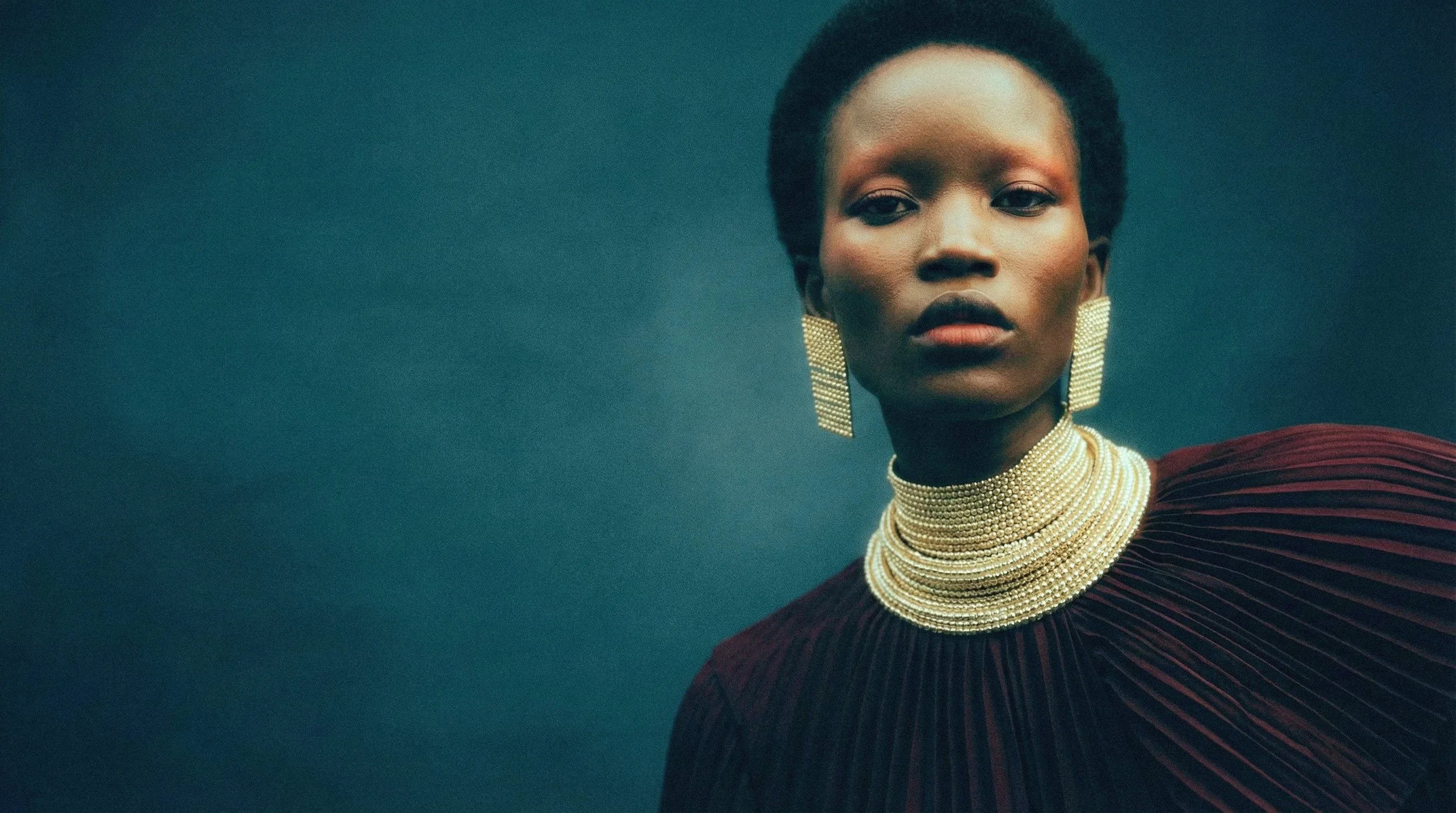
Deep burgundy sits against cool teal, creating a deliberate push and pull between warmth and distance.
The palette is tightly controlled—nothing competes, everything supports.
Gold accents cut through the frame, adding structure and rhythm rather than decoration.
Each hue is placed with intention, building contrast not through intensity, but through balance.
This is where color stops being aesthetic,
and starts becoming direction.